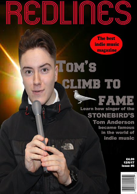
Redline magazine making Unit 14
Front cover print

The font I will be using for the masthead will be https://www.dafont.com/mexcellent.font I chose this font as it is text made up of lines. This will be suitable for my masthead as the title is "Redlines", so I will have the text in red. Red is used to get the readers attention as the colour stands out.
I used the photo of Tom with the microphone as my dominant image as it had a direct gaze which if someone was to look at it would get there attention. I had Tom use the microphone in the photo as it shows he is important, as the person who sings usually is the frontman and most famous of the band.
The microphone also fits my genre of music. The only photo manipulation used is the removal of background using the magic wand tool.
I used an image of a stone pigeon to be a symbol of the band which is called 'The Stonebird's'. The complications of this is it could lead to plagiarism, and using it without permission in a real published magazine could lead to the owner of the image taking you to court. However, I also did modify it from a 'clay' colour to a more concrete/stone colour.

I used gray as the colour of my text for my main sell-line as it stood out against the black background. It also is the colour of stone which fits the theme of The Stonebird's.
For my tagline I have used the line 'the best indie music magazine', which will tell the reader the genre, and will also make the reader think that this magazine is the best of its genre, aspirers/adventurers/reformers will think missing out if they aren't reading it.
Double page spread
I used colours on words like 'drugs' and 'music' as it will grab the readers attention and emphasize how much of an impact it would make.
I chose the photo of Joe as my dominant image as it seems a lot like most double page spread images used. So by comparing to other magazines' double page spreads I decided the photo of Joe was suitable.
I also used the photo of mitchell as it has a direct gaze at the reader which will also grab the readers attention.
Link to the stone pigeon used. I changed the background of the stone pigeon with an eraser, just leaving the head, body, and legs. I then also changed its colour to be a more stone/concrete colour.
I used the image of Joe for the double page spread as this one above was to dark. So the one I used seemed more suitable. I also think the pose was much better as well. Also the only photo manipulation on the on I used was I removed the background.
I choose the image of Tom over this one of Luke as this one of Luke seemed to look awkward and unnatural. Also I believe Tom is better dressed to look like a singer of a band. Also the chair Luke is sitting in can be seen, making it harder for editing very slightly.
I used the photo of Mitchell holding the scissors over Joe, as Joe looked incredibly sarcastic compared to Mitchell. I also liked the image of Joe I used for my double page spread and I didn't want to use the same person more than once. The only photo manipulation I used for Mitchell was that I removed the background with the magic wand tool.


Comments
Post a Comment